
Your T-Shirt Branding Weapon – 10 Creative Logo Ideas
You shouldn't just think of yourself as flipping t-shirts, you should be building a solid brand. And there's no better way to boost recognition and advertise yourself than using logos within your t-shirt designs.
But throwing a logo on as an afterthought isn't going to get you very far. You need to make your branding bold, creative and exciting!
Think of your t-shirt as a canvas; even though you’re still locked in with a narrow image design, you can still get creative. Whether you give your logo a different texture, an unconventional font size, or simply move it about the shirt, any boring logo can become a unique shirt.
But creativity doesn’t always mean loud colors and obnoxious images. With something as simple as a logo, creativity can be fostered in all kinds of ways. And if you get it right, your logo can even become the key feature of an attractive t-shirt!
10 Creative T-Shirt Logo and Branding Ideas
It seems like everyone chooses the same exact spot on their shirt to place their logo. And while this is effective and getting the brand’s name in front of people, it can also blend into the crowd when it looks like everyone else’s.
But even just changing the area where the logo appears can really make you stand out from the crowd. Here's some creative inspiration to get you going!
1. Low Down- Hem Logos
![]()
Some companies choose to move the logo away from the usual spot, choosing instead to go low. When your logo is moved down to the hem, it avoids the expected in-your-face effect, which actually makes it more eye-popping despite being away from eye level. Another way to uniquely use the hem of your shirt is to allow the logo to cut off at the bottom.
2. Oversized Logos
Typing your brand’s name or logo in a large size that covers as much of the shirt as possible, as well as in oversized characters, it can make even the simplest design pop. This is especially true if your brand uses a unique shape for their logo, such as Nike, Adidas, and other sports brands.
3. Small Logos
On the opposite end of the spectrum, utilizing a smaller logo size than expected can be equally effective. It probably shouldn’t be combined with busy color schemes or patterns, as it would easily be lost, but with solid blocks of color, a contrasting yet small logo can still draw plenty of attention.
3. Sleeves Logos
![]()
If you’re looking to keep the logo relatively high up on the shirt rather than the bottom of it, the sleeve is an effective compromise. This is especially true if the typeface if printed running downwards or in another unique way. Sleeves can also be utilized in more creative ways, with some brands going so far as to make their logo look like a tattoo. If you prefer longer sleeved shirts, this effect can be even more dramatic with the extra material.
4. Neck Line and Collar Logos
Designs running along the neckline or collar, on the other hand, double down on exposure from foot traffic. As people speak to someone wearing the shirt, or even passing by, the neck area is close enough to the face that it’s easy for anyone to transition their glance towards the logo. Other designers choose to use a minimal stripe running across the upper shoulder, making it subtle enough to let the shirt speak while being unique to draw specialized attention to the brand name.
5. Back Logos
![]()
Going across the back near the shoulder blades can have an appearance that’s like a sports jersey, or on top of the shoulders for a more simplified solution. If your particular design is intended for those with longer hair, it could run down the back vertically to ensure that it’s still visible.
6. Shiney Logos
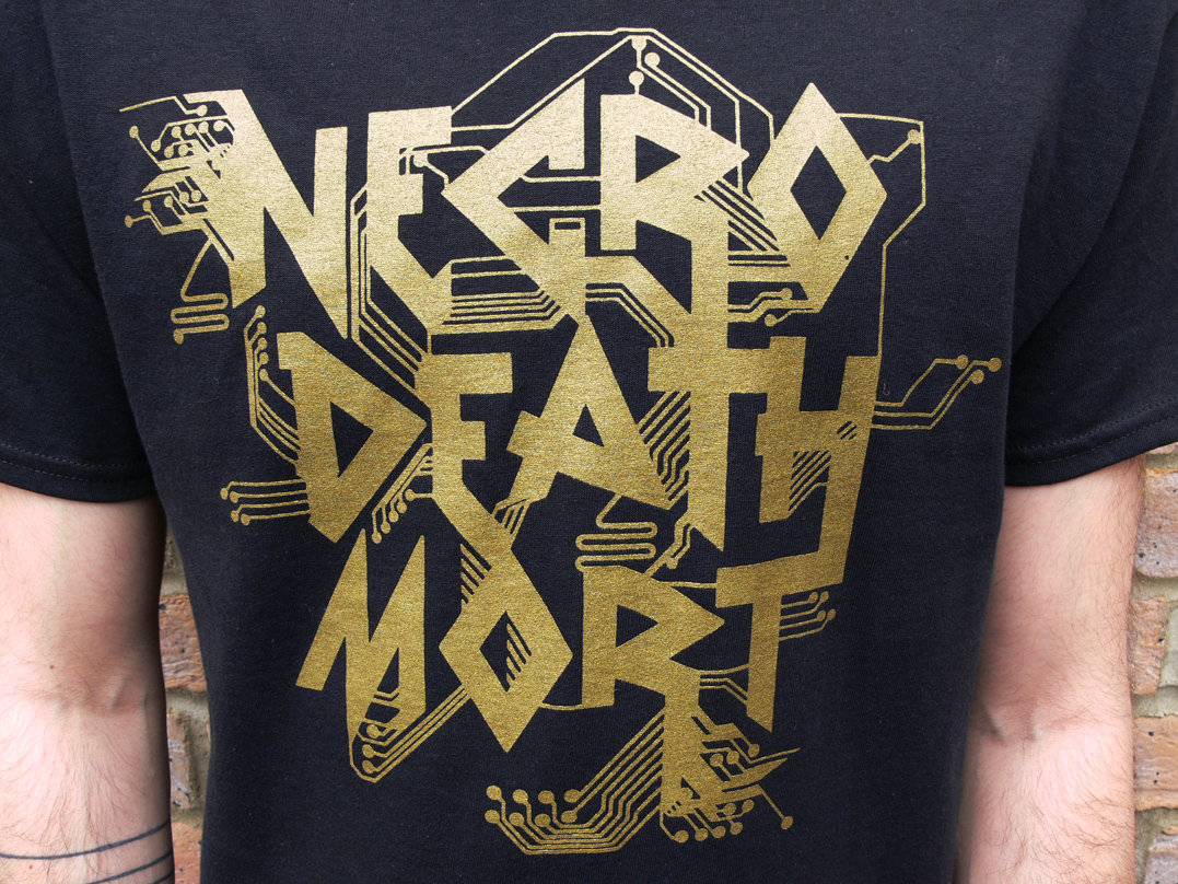
If you’re still struggling to do something different, but you don’t want to go crazy, try taking your traditional logo and giving it a metallic makeover. From using a shinier metal or even utilizing a foil print, it’s hard to ignore your logo when it shimmers in the sun.
Gold print lettering on a black shirt can capture a more urban feel on a shirt, which can be effective with even simple design choices.
7. Glow In the Dark Logos
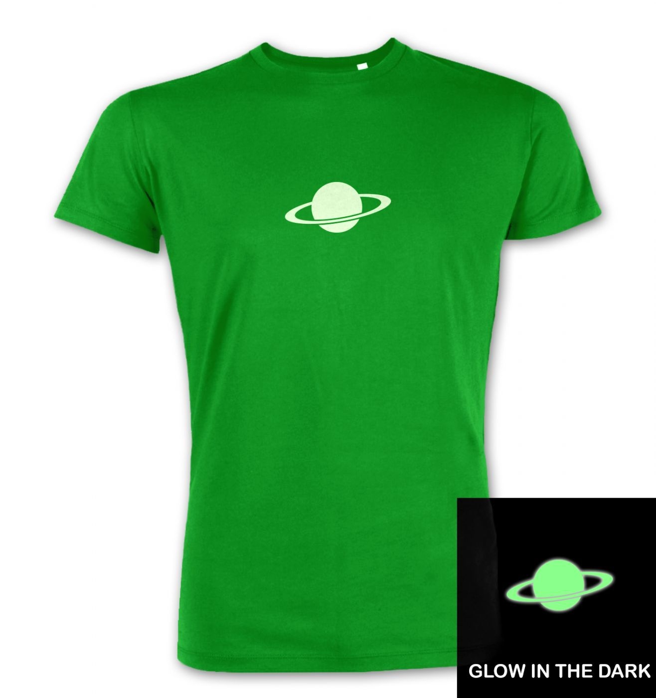
If foil printing makes you uncomfortable, try using glow in the dark ink, or even bright day-glow letters. Glow in the dark techniques can help promote shirts made for special occasions, either at a local glow party or even for a movie launch.
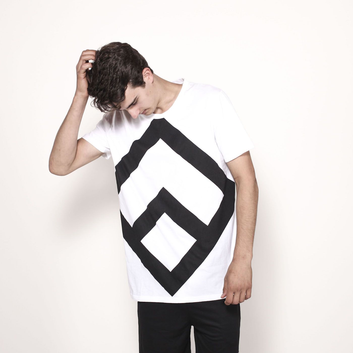
8. Directional Logos
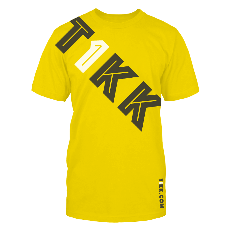
Just like how passing several billboards on the highway can make you blind to the different messages, the direction of logos on shirts suffer the same way. But when you choose to zag on them, you can catch more eyes when someone wears your design. By using a diagonally-flowing logo that takes up more of the shirt’s area, you can make a simple yet contrasting design. And this can go even further when different colors or patterns are used within the logo itself rather than the shirt.
9. Pocket Patch Logos
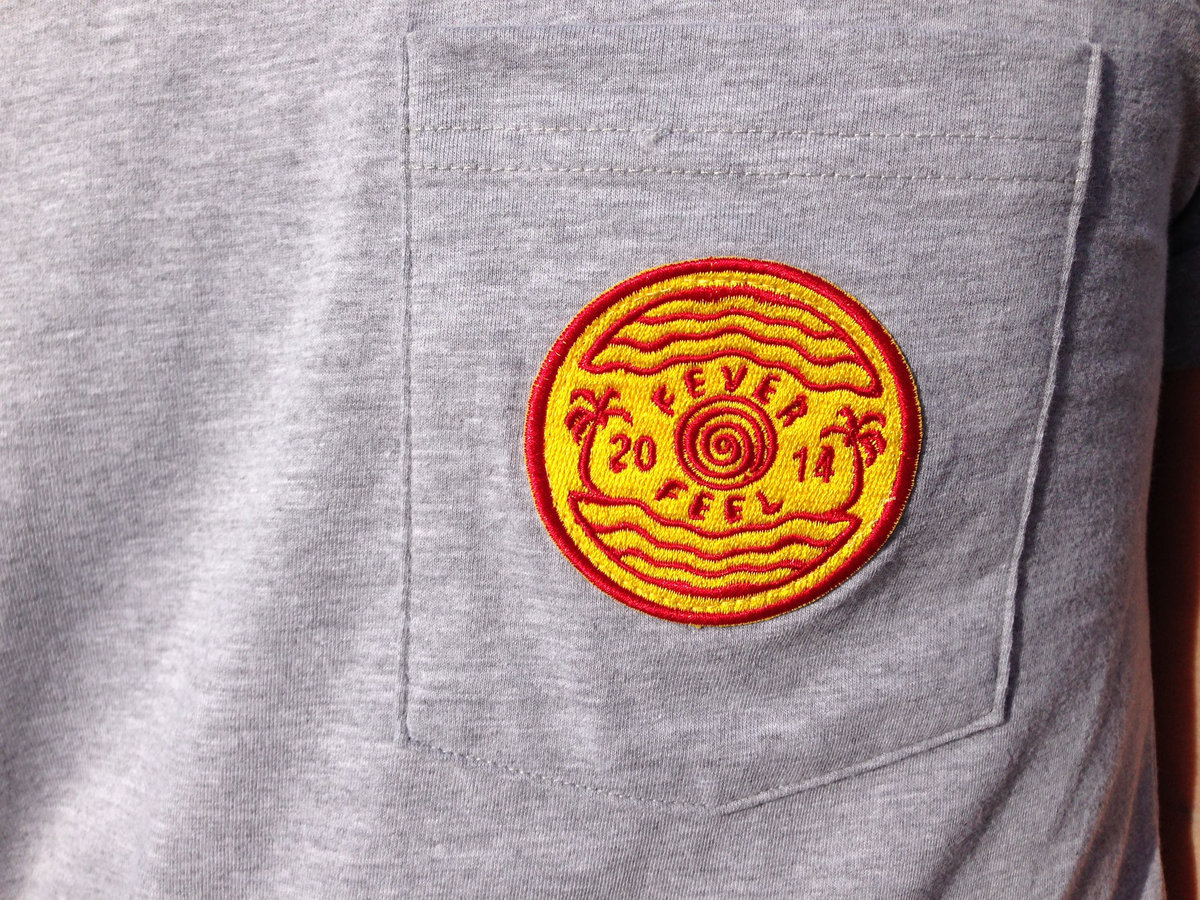
What if you really like the traditional chest-area placement? That’s no problem at all. You may as well give your logo the appearance of functionality; include a chest pocket, and then place the logo there. Or if you want to skip the breast pocket, why not give your logo it’s very own patch or even in an embroidered effect?
Patchwork-like additions can give a shirt a more concrete, 3-D-like feel, even if in just a small amount of space.
10. Chest Split Logo
![]()
If patchwork isn’t your thing, there are other options as well, such as creating two separate halves of the same logo and playing with the placement, creating a unique pattern that repeats across the shirt, or other unique design.